
Bar and line charts
Use a chart for trends and comparisons over categories: bars, a line, or both on a shared x-axis.
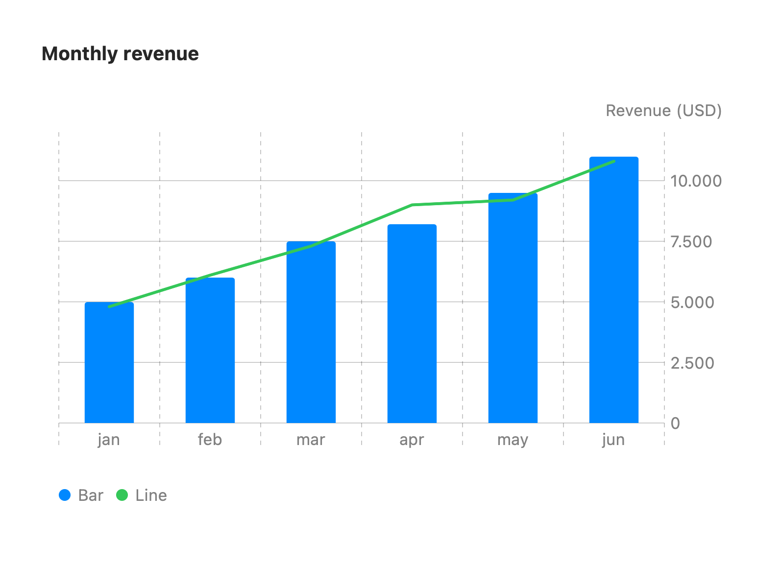
xychart-beta title "Monthly revenue" x-axis [jan, feb, mar, apr, may, jun] y-axis "Revenue (USD)" 0 --> 12000 bar [5000, 6000, 7500, 8200, 9500, 11000] line [4800, 6100, 7300, 9000, 9200, 10800]The first keyword is xychart-beta (or xychart).
x-axis [a, b, c]: the category labels.y-axis "Title" min --> max: titles the value axis. When both bounds are given they set the value range. Otherwise the plot scales automatically.bar [...]/line [...]: each adds a series of numbers, matched by index with the x-axis labels. Add as many as you like. Abarand alinetogether is the most common combination (shown above).
The card widens as the number of categories grows so dense charts stay readable. Unrecognized fields are ignored.
Horizontal orientation
Section titled “Horizontal orientation”Add horizontal to the xychart-beta line to flip the chart. Categories run top to bottom
down the side and values run left to right:
xychart-beta horizontal title "Budget by region" x-axis [North, South, East, West] y-axis "USD" 0 --> 50000 bar [32000, 18000, 27000, 41000]In horizontal mode the card grows taller, rather than wider, as the number of categories grows.