
Timeline diagrams
Use a timeline to show a history: a sequence of events on a horizontal time axis, grouped into eras. A Gantt chart is about durations and dependencies. A timeline is about moments: what happened, and in what order.
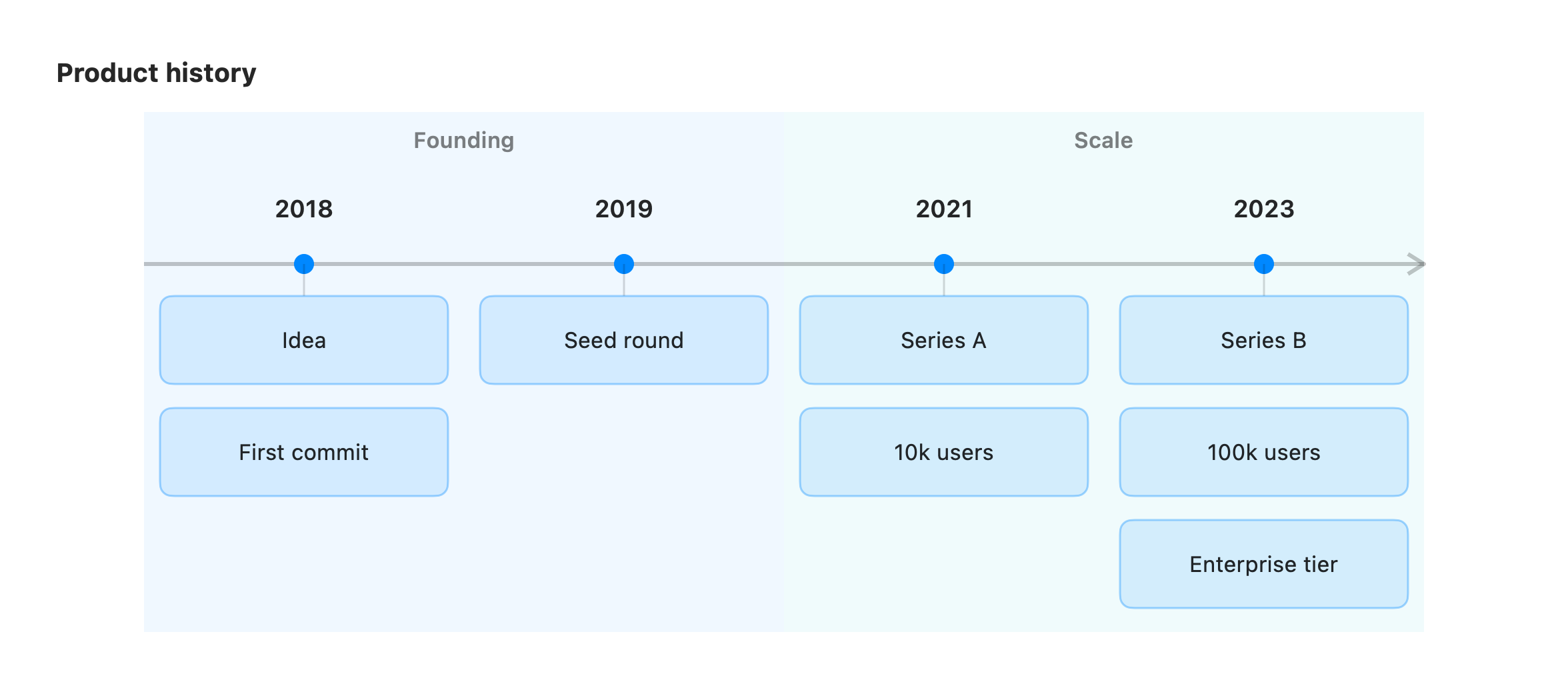
timeline title Product history section Founding 2018 : Idea : First commit 2019 : Seed round section Scale 2021 : Series A : 10k users 2023 : Series B : 100k users : Enterprise tierThe first keyword is timeline. title is optional. section <Name> groups the periods
beneath it into a band, so related events read as one era.
Each period is a row: <time> : <event> [ : <event> … ].
- time: the label on the axis (a year, a quarter, a date, or any short string).
- event: what happened at that time. Add more events under the same period by chaining
them with
:. Each becomes its own card in that column.
A line that starts with : (no time label) continues the previous period instead of
starting a new one. This is useful for a long list of events under one date:
2023 : Series B : 100k users : Enterprise tierUnrecognized lines are ignored, so a timeline always renders.
Annotations
Section titled “Annotations”In a vizzy fence after the diagram, target a period by its time label:
desc 2021: hit product-market fithint 2023: [Series B]("$40M led by BigVC")style 2021 fill:greennote over 2023: hiring spree beginsdesc <time>: text: a caption under the period.hint <time>: …: a click-to-open info badge at the period’s top-right.style <time> fill:…: colour a single period with a palette colour.note over <time>: text: pin a sticky note to the period’s column.
See the directives reference for the full list.